What’s coming in KDE Telepathy 0.4

It's been a long time since I've blogged about KDE Telepathy, we've got so much going on that we've had to delay the release so we can get everything perfect. Here's a sneak preview of all the new stuff in this release.

Log Viewer

Assuming you have had an application called TpLogger installed all your messages have been logged, only without a way to view them. Now in 0.4 I wrote a log viewer to see them all.

Merging Kopete logs is a work in progress, but it is being thought about (but probably not for 0.4).

Chat Plasmoid

As Lasath Fernando blogged previously we have a plasmoid for handling chats.

Since that blog Lasath and I have changed the behaviour slightly so that all new incoming chats open directly in this plasmoid (if installed) then there's a button to pop out to the full blown text interface if needed. It acts as a far more advanced notification interface, through which you can reply. It's very much like the GMail web interface, but integrating with your desktop. It also contains several fixes since it was first announced.

(font colours need to be sorted out clearly)

Contact List Plasmoid

This is a new addition to our features, this was originally started as a small part of a GSOC project by Francesco Nwokeka last year. It's since been tidied up to a proper Declarative Plugin and really simple QML.

What we're doing with all our new plasmoids is buliding nice-reusable declarative plugins and keeping our plasmoids are very desktop oriented. Plasma Active can then redo this in a very touch oriented way only redoing the GUI layer.

We still really need some design inspiration on ours though.

KRunner integration

Dan Vratil has written a KRunner plugin for KDE Telepathy allowing you to quickly search for your contacts and start chats, it's now passed our rather rigourous code reviews and heading into our repositories!

Fixes galore

Whilst we've been developing these new features, we've also been fixing little issues elsewhere; bugs and crashes to the small UI details. Daniele Domenichelli has made some massive improvements to the Adium Theme support in the main text view, amongst all sorts of other fixes.

Video support?

All the pieces towards working video are coming together thanks to the amazing work of George Kiagiadakis, so hopefully we can get video in this release. Don't count on it, and it's not quite ready for testing yet.

So when is it coming?

The release was originally scheduled for late March, however to get all these features perfect we are delaying the release slightly. You can see in the screenshots things are a bit rough round the edges so it'll be ready when it's ready, but we're aiming for around April/May.

Can I help?

Absolutely! Attracting attention is the only reason I write these posts :). We have a load of tasks that need doing, and not just coding. The contact list applet above needs a lot of designing, a mockup in photoshop/equivalent would be amazing. We still need more testers who report and triage bugs, and there's jobs for everyone. Plus we're a cool group to hang out with, honest.

Head down to #kde-telepathy on Freenode to find us.

How else can I help?

Contribute to our beer fund! This will be spent at Akademy and future sprints and split across all the members contributing to the project to buy us all a well deserved beer.

We all work on this purely in our free time with little compensation so it's things like this which keep us going.


A Review of Code Reviews

When I first started hacking on KDE-Telepathy the original manager was very insistent that all code should be reviewed before merging. Initially it was something that I considered a complete waste of time but has since grown on me as a really important step in development.

Recently, I've been getting involved with following another very prominent important KDE project and I've been a bit concerned by the "hack and slash" attitude that I see in that IRC channel with commits coming from all over the place, with very few of them looking like they're actually reviewed.

What's good about code reviews

Code reviews obviously result in "better code", but I think there is a tendency to think it's only for people making their first patches. This attitude is utter nonsense.

Many eyes make all bugs shallow

Also known as "Linus's law", the more people who look at a piece of code the more likely you are to find a bug. It's a lot easier to fix a potential bug at review stage than find it after it's deployed. Everyone makes mistakes, it's the best time to find them.

Shared responsibility

This is tied into the above. Let's say Martin submits a patch which I review which turns out to be crashy. Who's fault is it? It's his fault for the dodgy code but it's just as much my fault for not spotting it. It's also everyone else's fault for being too lazy to review the patch. I think code reviews take away some of the "blame game" when it comes to bugs.

Code habits

This is more for the people starting out, but it's a good time to spot the bad habits of missing "consts", bad whitespace, not checking for null pointers etc. It's better to point these out here and "block the commit" publicly so the submitter learns than to simply fix it for them.

Usability issues

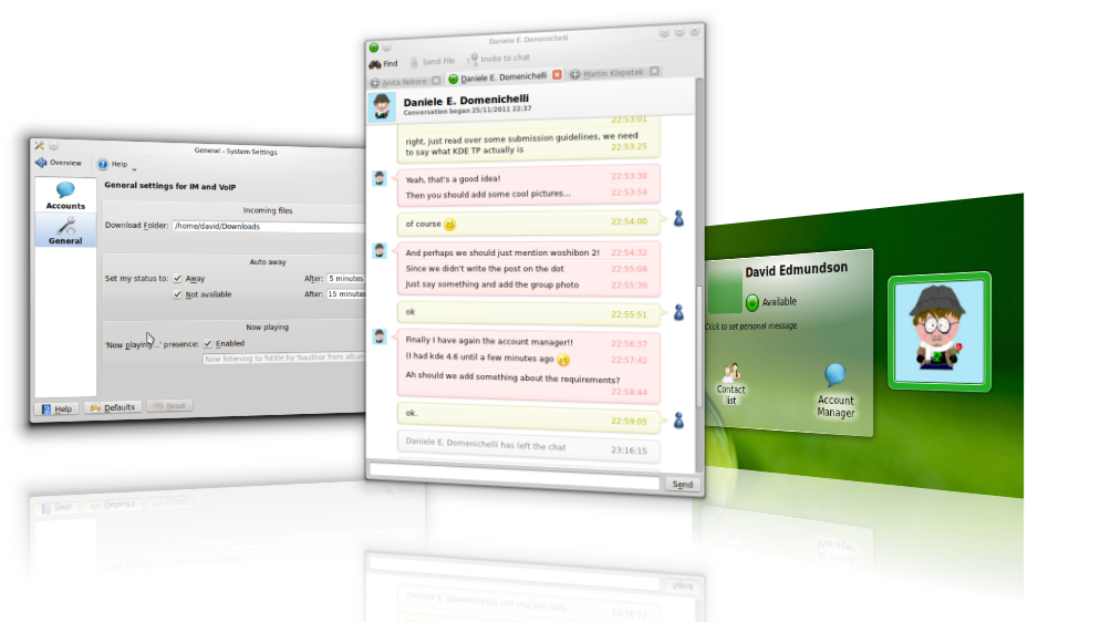
One of the main things we've gained from reviewboard is fixing situations where the code is perfectly fine, but what it's doing isn't. At review is a good time to make sure that not only the code is correct but that the user experience is the best it can be. This means checking any strings presented to the user, we've had huge arguments over the tiniest of details "Alias" vs "Nickname" and checking all forms are visually well laid out and arguing over each pixel in a paintEvent. It can be frustrating at the time, but I reckon we get a better product for it.

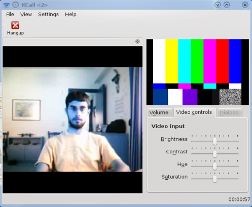
Attaching screenshots help. Occasionally we've done UI testing just with a screenshot. I've sent someone else a link and said "explain to me what you think this button does". If they're unsure, the text/layout needs changing.

Keeping code simple

A good coder can write complex code, an expert coder can achieve the same complex tasks in a really simple way. It seems counter-intuitive but the better programmer will be writing simpler code as you learn how to design things better. I have rejected perfectly working patches saying "rewrite this part so it's easier to read" or even a simple "comment this". If it takes me several minutes to understand a patch at review time where I'm only looking a small section and have a description it's going to be a real pain for the next coder who wants to edit some code around this or fix it.

I've heard rumours of code in KMail with a comment that says "//Don't touch this unless you are ....". That's a horrific state to be in, and a lesson we should all learn from to avoid. It's far easier to sort this at review time when the author can remember how the code works.

A second set of eyes may be able to find a cleaner way to do it, it's often easier to find the best way to solve a problem once you've first drafted something.

More awareness into goings on in the project

If I have to read the code well enough to be able to review it properly I'll have a better understanding of how everyone else's code works, this is very useful when you end up having to add a feature somewhere that relates to their code.

What sucks, and how to avoid it

ReviewBoard is sooo slow to use

Use post-review, It does work. However the version shipped by your distro may be too old for the version of reviewboard we have. Follow the instructions to installing post-review on the reviewboard website.

It's still slow

The post-review flags make things a lot easier, --guess-description is pretty good, it fills everything in based on your git commit logs.

Make an alias for reviews you type often. This is mine for all KDE Telepathy reviews.

alias tpreview='post-review --parent=master --tracking-branch=anonupstream/master --guess-summary --guess-description --target-groups=telepathy -o

It's still really slow

On #kde-telepathy you'll constantly see links to pastebin being sent about. We use this for small patches, it's not as formal as using review board but it gets the same job done.

Another speed-up trick we do is to point out changes but say "ship it!" anyway. If only trivial fixes are needed, there's not always a lot of point making them submit a new patch with it fixed.

Pushing a git branch is easier than reviewboard

Use that then, the tool isn't important, what's important is making sure reviews happen.

It's pointless for small patches

As with anything common sense is needed. I once got bugged on IRC "d_ed, d_ed can you review this" and showed me a change from "#include <QLabel>" to "#include <QtGui/QLabel>". Be pragmatic.

It blocks development

No it doesn't. As soon as you submit a review, create a new branch, carry on working. If you think reviews block development it probably means you need to improve your git-fu.

It's disheartening to see your code ripped apart

Absolutely, I once had a 2000 line patch that I wrote on Christmas Day torn apart by Martin who proved part of it was pointless and cut it down to about 400 lines, removing this really clever feature I had. It's better code for it though. Deal with it.

Reviews sit there for ages untouched

This is the biggest issue we face, some difficult patches no-one wants to review, and in such a small team like ours people are often simply away/busy. Having a patch stagnate is frustrating for everyone.

I also found a lot of the new people in the project felt "unworthy" to do reviews, which is silly. If I submit a difficult patch I may be waiting for a specific person to review it, but that doesn't mean any other reviews aren't highly valuable.

I'm not sure of other good ways to solve this.

It's hard to review large amounts of pre-existing code

Yeah 🙁 I have no idea how to solve this. We got this even for the few small apps in KDE TP, as every new app starts off as "just prototype code" in some scratch repo somewhere, then end up getting merged.

Summary

  • Everyone should have their code reviewed. If you think you're so good that you don't need reviews, you're mistaken.
  • Reviews are the perfect place to discuss UI isssues. Think about and challenge every user facing word, every UI decision.
  • Make that easier, attach screenshots
  • Use the appropriate tools for the job, for us this isn't always reviewboard for small commits.
  • Everyone should be involved in reviewing, don't leave it for someone else or people will be put off submitting things for review.

An Update on LightDM KDE

What's been going on?

  • We have an official repository in KDE Playground
  • Whilst I've been busy with actual job work (boo) and KDE Telepathy, Aurélien Gâteau has been making some outstanding progress helping me on it.

What is LightDM-KDE ?

LightDM is a login manager, much like KDM, GDM, XDM etc. It handles all the complexity of setting up X, and dealing with PAM for logging in users.

LightDM is interface-agnostic, so we built a KDE front end on top, cleverly called lightdm-kde.

Why is LightDM-KDE more awesome than everything else?

It has a well thought out, clean and simple to use configuration module

Use of QML makes themes a lot more powerful than anything elese . We have guest support (if the distro supports it) and can provide visual user selection. Hopefully by using QML we can also have a completely seamless changeover to KSplash which now also has a QML frontend.

I'm really excited about guest support, as it serves one other useful purpose; every KDE developer can test how their app looks when it first loads to a user without any excuses or difficult setup.

One of my main goals in LightDM-KDE is getting round this idea that themes and customisation are mutually exclusive, like we see in KDM. There are two tiers of customisation, wanting to change the background, some text or a corporate logo which many many users will want to do, and the second stage of wanting to build an entire new theme that looks radically different which is only used by a few people. Using technology stolen from plasma each theme can specify some configuration options, allowing the vast majority of users to make those little tweaks without having to learn how to build a whole new theme.

Is it ready?

LightDM-KDE is at that stage where it's ready for testing. You can try it out in a sandbox mode, by using "lightdm --test-mode" which starts a nested Xephyr X session without disturbing your normal login processes.

The backend itself, LightDM, is already deployed on Ubuntu and therefore has been tested on millions of computers already.

It's still a bit rough round the edges in a few places and therefore not really distro default ready. You can see this a bit in the screenshots, they're not as good as I want them to be but hopefully this will be fixed over the upcoming weeks. KDM still has some features we don't, but we have a /lot/ that KDM doesn't have.

Open any bugs at bugs.kde.org selecting the component LightDM.

If anyone has any designs/mockups for themes or better yet wants to design a theme please get in touch with me.

I installed it from source, and it doesn't work...

I recommend you use distro packages where available for all the extra code dealing with setting up init.d etc.

You will probably find you need to make a symlink in /usr/[local/]share/xgreeters called default.desktop to lightdm-kde-greeter.desktop. We cannot do this at install time as it would cause clashes.

Run with "lightdm -d" for debug, this will generally tell you what's wrong. If not, open a bug report.

How to report bugs – Usability Issues and Wishlists

There have been plenty of blog posts/articles about how to report bugs of problems and crashes, but when it comes to other types of bug reports what's required is a bit different.

Report the problem, not a proposed solution

Reporting usability issues is great, it's perfectly valid and even encouraged to open a report that says "it's tricky to do XYZ" or point out when something isn't intuitive, but it should be done properly.

This might sound obvious but it's very very common for people when making a usability request to report what they think something should be changed to rather than defining the actual problem.

I have a massive list of real bugs I could cite, but I'll give a made up example to not upset anyone; in KDE Telepathy we have a list of all the available types of accounts you can create. It's a fairly long list.

A bad usability bug:

"There should be a text filter where one can type in some text to filter the available options"

A good usability bug:

"when searching to create a Facebook account it took me a long time to find it in the large list"

I see hundreds of "The contact list should dock to the sys tray", "this should scroll vertically" or "this combobox shouldn't be editable", and none of these actually explain the problem. If you say what the problem is, then we can fix the actual problem.

It would be perfectly valid for the the good bug report to propose a solution in the comments, in fact I'd be happy to see it, but the "solution" should not be the main point.

By stating the problem really clearly it makes it clear why you want the change you want making, but it also enables everyone to brainstorm alternate solutions that solve the problem. For the example above, we found there were only a few favourites people chose regularly so it could be shown as a set of buttons which solves the original problem much better. It could well end up having the same result as you would propose, but no feature anywhere should be implemented without discussion and without weighing up all possible options.

When making a wishlist entry, state the use case

The above also applies for wishlists, say "why" you want something added. You'll get a better solution from it, and you're more likely to get a developer response if they understand the motivation.

As a developer it's very important to ask this "why?" question too, you'll avoid pointless feature creep, and give the user actually what they want rather than what they ask for. You might get some sensible answers, but also some ridiculous ones.

Some example unacceptable answers:

  • Just repeating the request
  • "Because we can" (a very bad mentality when it comes to adding things to the UI).
  • Because some other app does it.
  • Any incredibly niche situation that probably applies to no-one else.
  • An unexplained "I don't like XYZ", or worse, the completely arbitrary "it feels very windows-y"
  • As a bodgy workaround for a different problem.

Also when talking about wishlists it's perfectly ok to talk in first person; please say "I want...", don't say "Most users want..." unless you have actually asked most users. It won't help your case and it certainly annoys me.

KDE Telepathy Moves To Extragear

KDE Telepathy has now moved from playground to extragear! This is the first step towards slowly taking over as being the official default messaging client in KDE, which will kick the crap out of any other IM clients out there.

I'd like to publicly thank everyone who helped get us to this stage. It's not been an easy ride, and we've made our fair share of mistakes (I'm probably responsible for most of them). We still have a long way to go, we're mostly a very solid product, but there's a staggering amount of wishlist items and features needed before we can claim to be finished. Please join us in #kde-telepathy if you want to help out.

If you want to thank us for our hard work, many of us will be at FOSDEM, please use the donate button below help contribute to our beer fund. All donations will be spent exclusively on alcohol/partying and not wasted on anything productive.


KDE and LightDM revisited.

It's been a long time since my last blog post on LightDM and things have changed significantly since then.

LightDM is a login manager (think KDM/GDM) for Linux, it is written in a way that is completely backend/frontend independent so we can share our the complex parts with our Gnome friends, whilst keeping KDE UI layers on top. It is currently the default display manager in Ubuntu, and the front end they've made looks gorgeous.

There are two parts I've been working on, Qt bindings for LightDM which means anyone can easily write a whole new front end method in Qt, and a KDE front end using all the best KDE tech. The library has been majorly rewritten and the KDE front end has undergone a lot of work in the past few weeks..

The front end I'm building allows for loading of any QML file, which provides theme support. These themes are incredibly flexible, and allow the allow use of Plasma widgets, as well as anything else QML can provide. It's still /really/ fast.

On top of the flexible each theme can be configured indepantly which means we avoid the state we've seen elsewhere of options that don't do anything, or having to write a whole new theme just to change the background image.

Rather than talking, here is a load of screenshots, showing the two shipped themes and the start of the config.

Obviously everything shown below is a definite work in progress, far from finished, but everything generally works, and is starting to come together.

This is all avilable in a PPA for Ubuntu users at ppa:agateau/lightdm-kde.

Code is available from here, and LightDM available from here.

Hopefully this will be the first of several new blog posts with updates.

Please don't post comments about KDM, I wanted to redo the login experience, I looked at both and concluded that LightDM was the easiest to write a new UI layer for, and IMHO the more promising future with regards to support and features, such as guest support. If you have an opinion otherwise, you may as well keep it to yourself because I won't care.

KDE Telepathy 0.2 Released

We are pleased to announce the second release of KDE Telepathy.

KDE Telepathy is a suite of applications which together form an instant-messaging client allowing you to talk on Jabber, Gmail, Facebookm, MSN and much more. KDE Telepathy stands out from previous instant messaging clients by being able to integrate into the KDE workspace and plasma, as well as being able to be used like a traditional IM application.

This release features:

  • KWallet integration for storing of passwords
  • A plasmoid for instant access to a contact
  • Ability to set your status to the currently playing track from Amarok, Clementine or any other mpris2-compatiable player
  • Auto Away
  • Progress bar and cancel button for file transfers
  • Over 130 bug fixes and tweaks since 0.1!

Sprints

The whole team met at the Woshibon 2 sprint in Cambridge, UK (14th-18th September). This sprint was sponsored by both the KDE e.V and Collabora and allowed us to not only sort out many of the details in making this release, but planning out more long term goals as well.

The Future

This is still a very early release and far from what we want to call the "finished product", however all the functionality works and many of us now use it as a daily instant messaging client.

In the future we shall have contact aggregation, audio and video calls as well as more plasma integration, and much more!

We always appreciate the help from more developers, designers and testers; so if you are interested in helping please check out our wiki page at http://community.kde.org/Real-Time_Communication_and_Collaboration or join in IRC at #kde-telepathy on freenode.

Getting the Latest Release

The latest tarballs are available from KDE's FTP server
http://download.kde.org/download.php?url=unstable/telepathy-kde/0.2.0/src/ .

Be sure to check our wiki page for installation guidelines and troubleshooting help.

Packages may be available for your distribution.

Other News

I'm stepping down as manager for the 0.3 release. I have another project I want to work on as well as a tonne of uni work over the Christmas period. I'm handing over to the nearly as awesome Martin Klapetek to sort things out.

One week till KDE Telepathy 0.2

We're making the next magic release of KDE Telepathy next week, now would be the perfect time to help test and squash any final bugs before our second milestone release.

Included in this release:

  • KWallet integration
  • Auto Away and Now-Playing status messages
  • A contact plasmoid
  • Hundreds of bug fixes and other minor improvements

Compilation instructions are available here.

If you have any problems check the troubleshooting page, also I will be around most the weekend in #kde-telepathy if you have any further questions or difficulties.

We are still very much in a development phase, there are still plenty of rough edges, and we are still not as feature complete as other IM clients out there. However things are vastly improved from 0.1.

Note:
There are daily-build packages available for SuSE, but do not use the currently daily-builds from our Ubuntu PPA as they are currently broken and as such you will not be able to connect any account.

Padding and Spacing

What is padding?

Padding refers to the space between a border and an item, and between items. For simplicity we'll call padding, margins and spacing the same thing.

There are a few basic rules to follow:

Leaving room to breathe

If text or an icon ever touches the border it immediately looks wrong, visually you can't tell if something has been cropped, and it just looks generally messy. Anything less than 3 pixels looks cramped.

Being even

The amount of padding on the top and bottom should generally match so things look centred, and with even spacing each side. There are exceptions to this rule, but generally only when it is a conscious decision.

Consistency

This is one of the hardest ones to sort out. Consider the following two buttons. Both of these are perfectly valid, and obey the two rules above, and viewed on their own either of these are great. The problem is, if you put these side by side it looks wrong, one has a smaller icon and has larger spacing between the icon and the text - there's an immediate lack of consistency and they both end up looking out of place.

Of course all of these "rules" have exceptions, there are reasons when you want to be different or need to be, but this should only be the result of active decisions rather than accidents, which is what most issues appear to be.

Avoiding Mistakes

Widgets

In general we don't have this issue with QWidgets, widgets are in layouts and Qt adds appropriate margins (of 4 px on each side). However if a developer adds a custom paintEvent on a widget, manually adds fixed spacers to their dialogs or nests QWidgets with layouts this all needs thinking about again.

Below is a screenshot from a dialog in KDE with some straight lines drawn on.

Hopefully with the lines issues become apparent:

  • The word "Search" and "Calendar system" do not line up. They're at the same level of indentation, therefore they should line up.
  • There is a different level of spacing between the top header and the second header. Because both headers are in the same font, they 'must' mean the same thing, and therefore should have identical levels of subsequent padding. If one is meant to be a full title, the other a subtitle they should not be using the same font. (This is arguably a fault in KTitleWidget always adding a large space.)
  • Having any indentation on the form for the Calendar or Holidays section is inconsistent with (most) other KDE settings which don't indent after a title.

I think some of this can be sorted by making some special classes in kdeui which inherit from QLayoutItem and are at various fixed sizes to match normal indents and spaces. These needs to be exported to QtCreator to be useful. Rather than adding fixed spacers and setting them to 20px, it would be more consistent if people added a KStandardIndenter which made sure everyone used the same indents as defined here in KDE HIG Guidelines.

Another thing to watch out for is when making your own custom widget (in this example KHoliday::RegionSelector) to remove any margins in your widget otherwise you get double margins when it is actually used.

Plasmoids

With plasmoids it becomes an even bigger more common issue. Whilst some applets will use plasma layouts, with QML a lot more people are using direct anchors to position relatively to parent items. This means there is no code doing it for you and it's very easy to be inconsistent.

Here are some KDE examples; one good, one requiring some work.

The example on the left has no gaps round the outside and the text is not evenly spaced. There are three different sizes between the frame, the two lines of text and the bottom. There should be an equal gap between the top of the box and the top of first line of text and the bottom of the second line of text and the bottom of the frame.

The image on the right has a gap of 5 pixels between top text and border whereas the one on left only has 2.

Note how on the other example on the right has a large gap on the bottom yet still looks ok. This is because there is still a consistent spacing between the first line of text and the second and there is a big enough gap at the bottom that it looks deliberately lined up with the first line of text, rather than looking like it's floating in the middle of nowhere.

The big issue is the consistency if everything looked like the example on the left it wouldn't be too bad, but having a mix makes things worse.

Because the main is inconsistency rather than being right or wrong, this is a problem that needs to be solved with communication as much as code.

Another task that's worth doing is using the kwin zoom function and checking the plasmoid out more closely. If you can make it look good zoomed in 3x it's going to look great at a normal zoom.

Are single pixels really that important?

Yes! I think most people (myself included) don't notice the actual padding issues but see it and think "urgh, that's ugly" but can't immediately identify why.

As an example of how noticable the most minute detail is mouse over the close button in krunner, once someone points it out you can see the cross is ever so slightly shifted to the left. That's something that's out by only half a pixel! That's obviously being overly pedantic, but it shows how when we have things out by 4 pixels or more (like the difference above and below the line edit in krunner, the notification buttons, most of the panel settings) these things are glaringly obvious when you look for them, and subconciously irritating when you don't.

It's hardest to spot these things in your own designs. KDE Telepathy isn't perfect (nor is my website!) so this needs everyone to report bugs on even the most minor detail and to get involved with fixing them. It can feel stupid reporting on bugs this small, which has put me off doing it till now.


I've had some comments last blog post that my spam filter gets over-excited. If it does trap your comment, don't get stressed about it or resubmit, I'll look through the queue and mark them as non-spam in due course.

Things that I like in Gnome 3

A title that is effectively social-suicide to post on PlanetKDE, but I'll risk it anyway. I spent some time last week trying out Gnome 3.2, and it has a lot of really good ideas that we can steal take influence from.

I think as desktop developers it's always worth spending some time to see what our "competitors" are doing in both the open source and commercial world.

I've shared just a few of the things that stood out in Gnome 3 as things I liked.

Smart use of font colours

Gnome Labels

In this screenshot, we can see for a list of "label: value" the labels are slightly greyed out. I really like this, as your eyes are instantly drawn to the information you want to see, the values that change not the label. My brain doesn't need to see the label to know that "100 Mb/s" refers to the speed, or see something formatted like an IP address and it makes it quicker to find this information.

KDE Labels

The equivalent KDE application uses this (IMHO) the wrong way round. What's worse is on the KDE the use of when to bold text is inconsistent. The battery plasmoid uses bold text on the values in the applet, but in the tooltip, this is reversed. We have inconstancy within a single applet. Also generally bold fonts are harder to read and should be used with caution.

Use of fonts are a risky business, using too many will make the desktop look inconsistent and messy. A good desktop experience needs a small set, with clear defined rules as to what to use where.

Borderless windows

With the drop-shadow effect, window borders aren't needed. The shadow shows where the window ends and removing borders not only gives you a few extra pixels, it removes one layer of the "boxes inside boxes inside boxes" look that tends to plague KDE apps. Below is an image of dolphin in Gnome's window manager.

Dolphin running in Gnome's WM.

"But you can already do that in KDE".

That's sort of true. In KDE you can remove the border, but not in a way that actually works. In Gnome they've done something clever, the borders are missing but moving to the edge of the window (on any size) still displays size grips for a few pixels around the window, a larger size area to resize from than the standard thin borders KDE has. It's a move that results in a better appearance and an easier to use experience, something that's much better than having lots of options.

Consistency

Every indicator in gnome has mockups and was designed by a single group who talk to each other. Each KDE plasmoids are mostly created by a single team/person, which doesn't lead to consistency. Click on one of my icons could open a plasma applet, a QWidget styled menu, or even open a dialog in the middle of the screen. Visually each applet is different, with a mixed use of fonts, padding and design.

Number of tray icons


Whilst Gnome just has a few indicators, my desktop has millions. This is caused by the lack of a regulating team that says "this panel is only allowed to have XYZ". A lot of the indicators here do nothing, they just inform me that an application is running. I don't need to be told that. KOrganizer for example has an icon to show me that the event reminder daemon is running? No-one needs that, if I have reminders in my calendar it should be running a daemon, if not, then it shouldn't be running. No point giving me as a user an option to break my event notifications (by turning it off) and I don't want to be notified that things are working as expected.

All this effort to phase out system tray icons in plasma hasn't really been helped by the number of applications making things that still use them, for no real reason.

Proper padding

Padding refers to the spacing between the inside of a border and the content, with plasma and QML this moved to being something done by the developer and not the widget engine. Whilst this gives flexibility to be clever it allows developers to do it wrong. I intend to make an entire blog post about proper-padding in the future, along with hopefully a bucket load of patches.

It's not perfect

Whilst Gnome 3 is very very polished, it is missing quite a few things. Our desktop needs a lot of work and extreme focus on user experience to match theirs, but there's plenty of chance for staying continually better. At least our users can shut down.