A title that is effectively social-suicide to post on PlanetKDE, but I'll risk it anyway. I spent some time last week trying out Gnome 3.2, and it has a lot of really good ideas that we can steal take influence from.
I think as desktop developers it's always worth spending some time to see what our "competitors" are doing in both the open source and commercial world.
I've shared just a few of the things that stood out in Gnome 3 as things I liked.
Smart use of font colours
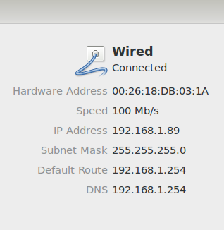
In this screenshot, we can see for a list of "label: value" the labels are slightly greyed out. I really like this, as your eyes are instantly drawn to the information you want to see, the values that change not the label. My brain doesn't need to see the label to know that "100 Mb/s" refers to the speed, or see something formatted like an IP address and it makes it quicker to find this information.
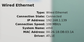
The equivalent KDE application uses this (IMHO) the wrong way round. What's worse is on the KDE the use of when to bold text is inconsistent. The battery plasmoid uses bold text on the values in the applet, but in the tooltip, this is reversed. We have inconstancy within a single applet. Also generally bold fonts are harder to read and should be used with caution.
Use of fonts are a risky business, using too many will make the desktop look inconsistent and messy. A good desktop experience needs a small set, with clear defined rules as to what to use where.
Borderless windows
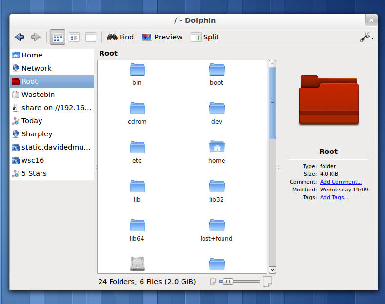
With the drop-shadow effect, window borders aren't needed. The shadow shows where the window ends and removing borders not only gives you a few extra pixels, it removes one layer of the "boxes inside boxes inside boxes" look that tends to plague KDE apps. Below is an image of dolphin in Gnome's window manager.
"But you can already do that in KDE".
That's sort of true. In KDE you can remove the border, but not in a way that actually works. In Gnome they've done something clever, the borders are missing but moving to the edge of the window (on any size) still displays size grips for a few pixels around the window, a larger size area to resize from than the standard thin borders KDE has. It's a move that results in a better appearance and an easier to use experience, something that's much better than having lots of options.
Consistency
Every indicator in gnome has mockups and was designed by a single group who talk to each other. Each KDE plasmoids are mostly created by a single team/person, which doesn't lead to consistency. Click on one of my icons could open a plasma applet, a QWidget styled menu, or even open a dialog in the middle of the screen. Visually each applet is different, with a mixed use of fonts, padding and design.
Number of tray icons
Whilst Gnome just has a few indicators, my desktop has millions. This is caused by the lack of a regulating team that says "this panel is only allowed to have XYZ". A lot of the indicators here do nothing, they just inform me that an application is running. I don't need to be told that. KOrganizer for example has an icon to show me that the event reminder daemon is running? No-one needs that, if I have reminders in my calendar it should be running a daemon, if not, then it shouldn't be running. No point giving me as a user an option to break my event notifications (by turning it off) and I don't want to be notified that things are working as expected.
All this effort to phase out system tray icons in plasma hasn't really been helped by the number of applications making things that still use them, for no real reason.
Proper padding
Padding refers to the spacing between the inside of a border and the content, with plasma and QML this moved to being something done by the developer and not the widget engine. Whilst this gives flexibility to be clever it allows developers to do it wrong. I intend to make an entire blog post about proper-padding in the future, along with hopefully a bucket load of patches.
It's not perfect
Whilst Gnome 3 is very very polished, it is missing quite a few things. Our desktop needs a lot of work and extreme focus on user experience to match theirs, but there's plenty of chance for staying continually better. At least our users can shut down.