Padding and Spacing

What is padding?

Padding refers to the space between a border and an item, and between items. For simplicity we'll call padding, margins and spacing the same thing.

There are a few basic rules to follow:

Leaving room to breathe

If text or an icon ever touches the border it immediately looks wrong, visually you can't tell if something has been cropped, and it just looks generally messy. Anything less than 3 pixels looks cramped.

Being even

The amount of padding on the top and bottom should generally match so things look centred, and with even spacing each side. There are exceptions to this rule, but generally only when it is a conscious decision.

Consistency

This is one of the hardest ones to sort out. Consider the following two buttons. Both of these are perfectly valid, and obey the two rules above, and viewed on their own either of these are great. The problem is, if you put these side by side it looks wrong, one has a smaller icon and has larger spacing between the icon and the text - there's an immediate lack of consistency and they both end up looking out of place.

Of course all of these "rules" have exceptions, there are reasons when you want to be different or need to be, but this should only be the result of active decisions rather than accidents, which is what most issues appear to be.

Avoiding Mistakes

Widgets

In general we don't have this issue with QWidgets, widgets are in layouts and Qt adds appropriate margins (of 4 px on each side). However if a developer adds a custom paintEvent on a widget, manually adds fixed spacers to their dialogs or nests QWidgets with layouts this all needs thinking about again.

Below is a screenshot from a dialog in KDE with some straight lines drawn on.

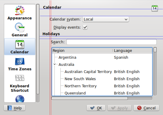
Hopefully with the lines issues become apparent:

  • The word "Search" and "Calendar system" do not line up. They're at the same level of indentation, therefore they should line up.
  • There is a different level of spacing between the top header and the second header. Because both headers are in the same font, they 'must' mean the same thing, and therefore should have identical levels of subsequent padding. If one is meant to be a full title, the other a subtitle they should not be using the same font. (This is arguably a fault in KTitleWidget always adding a large space.)
  • Having any indentation on the form for the Calendar or Holidays section is inconsistent with (most) other KDE settings which don't indent after a title.

I think some of this can be sorted by making some special classes in kdeui which inherit from QLayoutItem and are at various fixed sizes to match normal indents and spaces. These needs to be exported to QtCreator to be useful. Rather than adding fixed spacers and setting them to 20px, it would be more consistent if people added a KStandardIndenter which made sure everyone used the same indents as defined here in KDE HIG Guidelines.

Another thing to watch out for is when making your own custom widget (in this example KHoliday::RegionSelector) to remove any margins in your widget otherwise you get double margins when it is actually used.

Plasmoids

With plasmoids it becomes an even bigger more common issue. Whilst some applets will use plasma layouts, with QML a lot more people are using direct anchors to position relatively to parent items. This means there is no code doing it for you and it's very easy to be inconsistent.

Here are some KDE examples; one good, one requiring some work.

The example on the left has no gaps round the outside and the text is not evenly spaced. There are three different sizes between the frame, the two lines of text and the bottom. There should be an equal gap between the top of the box and the top of first line of text and the bottom of the second line of text and the bottom of the frame.

The image on the right has a gap of 5 pixels between top text and border whereas the one on left only has 2.

Note how on the other example on the right has a large gap on the bottom yet still looks ok. This is because there is still a consistent spacing between the first line of text and the second and there is a big enough gap at the bottom that it looks deliberately lined up with the first line of text, rather than looking like it's floating in the middle of nowhere.

The big issue is the consistency if everything looked like the example on the left it wouldn't be too bad, but having a mix makes things worse.

Because the main is inconsistency rather than being right or wrong, this is a problem that needs to be solved with communication as much as code.

Another task that's worth doing is using the kwin zoom function and checking the plasmoid out more closely. If you can make it look good zoomed in 3x it's going to look great at a normal zoom.

Are single pixels really that important?

Yes! I think most people (myself included) don't notice the actual padding issues but see it and think "urgh, that's ugly" but can't immediately identify why.

As an example of how noticable the most minute detail is mouse over the close button in krunner, once someone points it out you can see the cross is ever so slightly shifted to the left. That's something that's out by only half a pixel! That's obviously being overly pedantic, but it shows how when we have things out by 4 pixels or more (like the difference above and below the line edit in krunner, the notification buttons, most of the panel settings) these things are glaringly obvious when you look for them, and subconciously irritating when you don't.

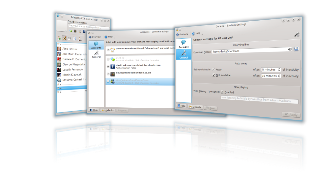
It's hardest to spot these things in your own designs. KDE Telepathy isn't perfect (nor is my website!) so this needs everyone to report bugs on even the most minor detail and to get involved with fixing them. It can feel stupid reporting on bugs this small, which has put me off doing it till now.


I've had some comments last blog post that my spam filter gets over-excited. If it does trap your comment, don't get stressed about it or resubmit, I'll look through the queue and mark them as non-spam in due course.

Things that I like in Gnome 3

A title that is effectively social-suicide to post on PlanetKDE, but I'll risk it anyway. I spent some time last week trying out Gnome 3.2, and it has a lot of really good ideas that we can steal take influence from.

I think as desktop developers it's always worth spending some time to see what our "competitors" are doing in both the open source and commercial world.

I've shared just a few of the things that stood out in Gnome 3 as things I liked.

Smart use of font colours

Gnome Labels

In this screenshot, we can see for a list of "label: value" the labels are slightly greyed out. I really like this, as your eyes are instantly drawn to the information you want to see, the values that change not the label. My brain doesn't need to see the label to know that "100 Mb/s" refers to the speed, or see something formatted like an IP address and it makes it quicker to find this information.

KDE Labels

The equivalent KDE application uses this (IMHO) the wrong way round. What's worse is on the KDE the use of when to bold text is inconsistent. The battery plasmoid uses bold text on the values in the applet, but in the tooltip, this is reversed. We have inconstancy within a single applet. Also generally bold fonts are harder to read and should be used with caution.

Use of fonts are a risky business, using too many will make the desktop look inconsistent and messy. A good desktop experience needs a small set, with clear defined rules as to what to use where.

Borderless windows

With the drop-shadow effect, window borders aren't needed. The shadow shows where the window ends and removing borders not only gives you a few extra pixels, it removes one layer of the "boxes inside boxes inside boxes" look that tends to plague KDE apps. Below is an image of dolphin in Gnome's window manager.

Dolphin running in Gnome's WM.

"But you can already do that in KDE".

That's sort of true. In KDE you can remove the border, but not in a way that actually works. In Gnome they've done something clever, the borders are missing but moving to the edge of the window (on any size) still displays size grips for a few pixels around the window, a larger size area to resize from than the standard thin borders KDE has. It's a move that results in a better appearance and an easier to use experience, something that's much better than having lots of options.

Consistency

Every indicator in gnome has mockups and was designed by a single group who talk to each other. Each KDE plasmoids are mostly created by a single team/person, which doesn't lead to consistency. Click on one of my icons could open a plasma applet, a QWidget styled menu, or even open a dialog in the middle of the screen. Visually each applet is different, with a mixed use of fonts, padding and design.

Number of tray icons


Whilst Gnome just has a few indicators, my desktop has millions. This is caused by the lack of a regulating team that says "this panel is only allowed to have XYZ". A lot of the indicators here do nothing, they just inform me that an application is running. I don't need to be told that. KOrganizer for example has an icon to show me that the event reminder daemon is running? No-one needs that, if I have reminders in my calendar it should be running a daemon, if not, then it shouldn't be running. No point giving me as a user an option to break my event notifications (by turning it off) and I don't want to be notified that things are working as expected.

All this effort to phase out system tray icons in plasma hasn't really been helped by the number of applications making things that still use them, for no real reason.

Proper padding

Padding refers to the spacing between the inside of a border and the content, with plasma and QML this moved to being something done by the developer and not the widget engine. Whilst this gives flexibility to be clever it allows developers to do it wrong. I intend to make an entire blog post about proper-padding in the future, along with hopefully a bucket load of patches.

It's not perfect

Whilst Gnome 3 is very very polished, it is missing quite a few things. Our desktop needs a lot of work and extreme focus on user experience to match theirs, but there's plenty of chance for staying continually better. At least our users can shut down.

Moving files between git repositories

In our project we had to move several files between git repositories. Having searched the internet, there didn't seem to be any well defined way to do it. I don't claim to be a git wizard, but I came up with a solution that I wanted to share in case it was useful to anyone else.

There is a method to filter a folder in a git repository which can then be used to move between repositories, but not so easily for files. I came up with a method that effectively involves rewriting the history to put everything into a folder which we then steal.

As we are using filter-branch we first need to take a clone of the source repository. Filter-branch is a destructive command that actually edits the history and will destroy your repository.

#!/usr/bin/python
import os

files = ["service-availability-checker.cpp",
"service-availability-checker.h"]

for filename in files:
    if not os.access("keep", os.R_OK):
        os.mkdir("keep")
    if os.access(filename, os.R_OK):
       os.rename(filename, "keep/"+filename)

move-files.py

git filter-branch --tree-filter /path/to/move-files.py

Now we can grab the folder we wanted

git filter-branch --subdirectory-filter keep/

Now we turn the directory into a set of patches

git format-patch HEAD^ HEAD

This gives us a nice set of patch files which contain commit information which can be imported into a new repository.

KDE Telepathy 0.2 Approaching Hard Feature Freeze

KDE Telepathy 0.2 isn't too far away, so I thought I'd give a bit of a progress update.

We've mostly been working hard to tidy up and stabilise most of what we offered in 0.1, but we've also brought in a few shiny features:

Most anticipated of all, there is no longer a dependency on gnome-keyring! Upstream (telepathy) had provided a (mostly working) mechanism for us to provide our own passwords, so we have perfect KWallet integration.

Over the sprint I implemented drag+drop on our contact applet plasmoid so they interact nicely with the contact list.

We've made it even easier to see other contacts on your local network (bonjour) added auto away and "now playing" presence messages.

There's still a lot of things left to sort out, but 0.2 but it is shaping up to be a solid release!

We're about 1 week away from a hard feature freeze, aiming for a full release in early november. If you want to get involved, or start early beta testing please join us in #kde-telepathy.

Now for some pics and videos!

Vimeo Link